Introduction to Lume (Part 4) - Reusing Page Components as Components
Back to Top
To reach a broader audience, this article has been translated from Japanese.
You can find the original version here.
Previous introduced how to enhance page searchability using Lume's tag management. Here, we created a tag list page using the Search plugin and Paginate plugin.
This time, the theme is componentization and reuse of UI parts. Nowadays, with the widespread use of frontend frameworks like React and Vue, it has become commonplace to componentize UI in a component-oriented manner. Lume is positioned as an SSG rather than a framework, but it comes with powerful component features.
As stated in the official documentation, Lume components are available from anywhere without depending on the template engine.
This time, we will create components with Nunjucks and JSX and see how to use them from various templates[1].
On 2023-12-08, Lume had a major update to v2. Accordingly, this article has also been updated to work with v2.
The _includes directory is a special directory that stores templates that are not the main page. Although not much mentioned in the Lume documentation, this directory can be used not only for layout files but also for components. Below is an example of using a component placed in _includes/component.njk from a page created with Nunjucks.
<article>
  <h2>Using UI components with Nunjucks include</h2>
  {% include 'component.njk' %}
</article>
In Eleventy, this usage was common, but in Lume, the component feature independent of the template engine introduced in this article seems to be recommended.
Creating Components with Nunjucks
#First, let's create an alert box component with Nunjucks. Place the following Nunjucks template (alertbox.njk) under _components.
<div class="alert alert-{{type}}">
  {{message}}
</div>
It is a simple one that receives type and message and outputs the message inside the div tag.
To use this component, do the following.
---
title: Introduction to Lume Components
url: /components/nunjucks/
layout: layouts/blog.njk
---

{{ comp.alertbox({ type: 'info', message: 'This is a Nunjucks component'}) | safe }}
The key point is where the comp variable is used. The components created under _components are stored in this object. In Nunjucks templates, you can directly access this comp variable. Each component can specify variable parameters as arguments in object format.
When you generate a page with this template, the following HTML is output (excerpt).
<main>
  <article>
    <h2>Introduction to Lume Components</h2>
    <div class="alert alert-info">
      This is a Nunjucks component
    </div>
  </article>
</main>
You can see that the alert box component is expanded within the page.
You can use components created with Nunjucks from JSX/MDX templates, but since Nunjucks components are rendered as strings, they will be escaped. To render them as HTML, you need to use dangerouslySetInnerHTML.
export default ({comp}: Lume.Data) => (
  <div dangerouslySetInnerHTML={{
    __html: comp.alertbox({type: "info", message: "This is a Nunjucks component"})
  }} />
)
It feels quite unfortunate. If you are using JSX/MDX as a template, it seems better to create components as JSX unless there is a special reason.
Creating Components with JSX
#Earlier, we saw how to create components with Nunjucks. Next, let's create it with JSX.
Let's rewrite the same alert box in JSX (TSX).
interface Props extends Lume.Data {
  type: 'info' | 'warning' | 'error';
  message: string;
}

export default ({ type, message }: Props) => (
  <div className={`alert alert-${type}`}>
    { message }
  </div>
)
It is a simple JSX component that needs no explanation[2].
Note that reactive implementations such as useState or event handlers do not work. Lume does not concern itself with client-side behavior. It is only used for rendering at page generation.
As of now, JSX/MDX is not a built-in plugin. If you want to use it as a template, you need to enable it separately. For details, refer to the following.
Using this component from each template would look like this.
- Nunjucks Template
---
title: Introduction to Lume Components
url: /components/jsx/
layout: layouts/blog.njk
---

{{ comp.AlertBox({ type: 'info', message: 'This is a JSX component'}) | safe }}
- JSX(TSX) Template
export const title = "Introduction to Lume Components";
export const url = "/components/jsx/";
export const layout = "layouts/blog.njk";

export default ({ comp }: Lume.Data) => (
  <comp.AlertBox type="info" message="This is a JSX component" />
)
- MDX Template
---
title: Introduction to Lume Components
url: /components/jsx/
layout: layouts/blog.njk
---

<comp.AlertBox type="info" message="This is a JSX component" />
Similar to Nunjucks components, you access each component from the comp variable. Especially for JSX/MDX, custom tags can be used directly in the template (parameters become Props). It has become more intuitive for React users.
Outputting CSS for Components
#Finally, let's introduce an interesting feature provided by Lume's component feature. In Lume, in addition to the component itself, you can output CSS or JavaScript resources for the component to a separate file.
Here, let's apply CSS to the JSX alert box created this time[3]. The component will be as follows.
// Output CSS for the component
export const css = `
  .alert {
    padding: 10px;
    margin-bottom: 10px;
    border: 1px solid transparent;
    border-radius: 4px;
  }
  .alert-info {
    color: #31708f;
    background-color: #d9edf7;
    border-color: #bce8f1;
  }
  .alert-warning {
    color: #8a6d3b;
    background-color: #fcf8e3;
    border-color: #faebcc;
  }
  .alert-error {
    color: #a94442;
    background-color: #f2dede;
    border-color: #ebccd1;
  }
`

interface Props extends Lume.Data{
  type: 'info' | 'warning' | 'error';
  message: string;
}

export default ({ type, message }: Props) => (
  <div className={`alert alert-${type}`}>
    { message }
  </div>
)
The key point is where the css variable is exported. No other code changes are needed. When you export this variable, Lume outputs its content to /components.css during the build.
Incidentally, for JavaScript, if you write JavaScript in the js variable, it will be output to /components.js.
Then, link this CSS in the layout file.
<head>
  <link rel="stylesheet" href="/components.css" />
</head>
By doing this, the alert box component will be displayed as follows.
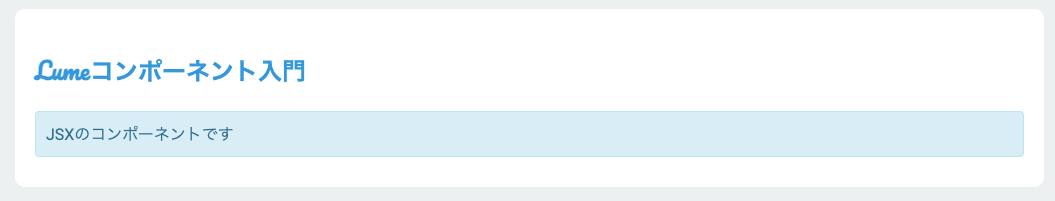
You can see that the style is applied to the component. The point is that this CSS is output only if the target component is used. If not used, it is not included in the CSS, saving size.
However, the output file is one file each for CSS/JavaScript, so if there is duplicate content, it will be overwritten by either specification. If used by many components, it might be better to add a component prefix or some other method.
Summary
#This time, we introduced the component feature provided by Lume. Even for static sites, if UI componentization goes well, future maintenance becomes easier, so it is something we definitely want to utilize.
In fact, the method of creating UI components (JSX) and using them from MDX is touched upon in Introduction to Lume (Part 2). ↩︎
Here, we are extending Lume's Lume.Data as Props, but since we are not using Lume-specific data (like search or paginate), it is not mandatory. ↩︎
For Nunjucks components, you can do the same by specifying css or js in the component's front matter. ↩︎