Easily Analyze Open Data Using Excel
Back to TopTo reach a broader audience, this article has been translated from Japanese.
You can find the original version here.
Until recently, I couldn't let go of my cold-weather clothes, but it has become quite warm. When you go outside, you see people with shiny new backpacks and crisp suits, looking dazzling as they seem excited about their new lives. Although I now often engage in behavior that might make you wonder about my manners, I fondly remember my days as a new employee years ago, scrambling through training that included business manners and document preparation.
Excel, a beloved spreadsheet tool, often appears in training for newcomers. It is almost always installed on business-use Windows PCs, and users often extend its use beyond its intended functions, employing it for project management or as a drawing/modeling tool. However, the real selling point of this tool is its flexible features that support processing and analyzing tabular data.
Now, recalling the spirit of a newcomer to the workforce, let's implement a relatively simple data analysis tool using Excel's features. The data for analysis can be anything, but since this is a 'developer' site, let's use data that can be obtained from the web.
Acquiring Data for Analysis
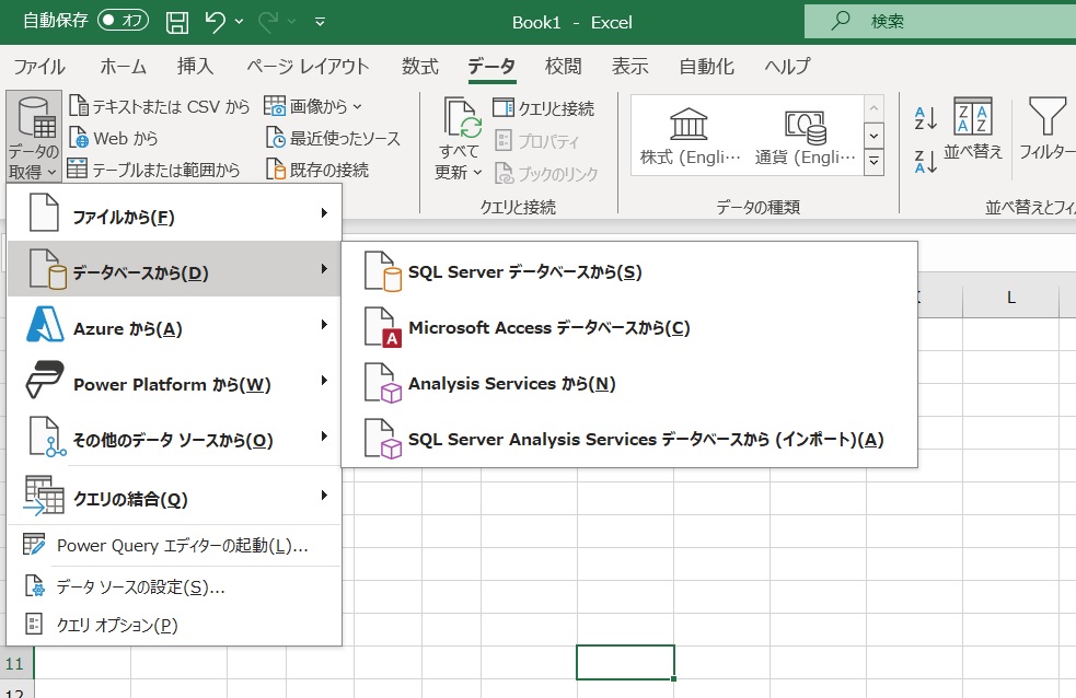
#First, we input the data into Excel. Excel includes a feature called PowerQuery, which allows you to define data input processes in a low-code environment. In my environment (Office365 V2403), this can be done via the 'Data' menu. When you select 'Get Data' from the ribbon menu, you can see that it's possible to set up various data sources such as files, databases, and APIs.
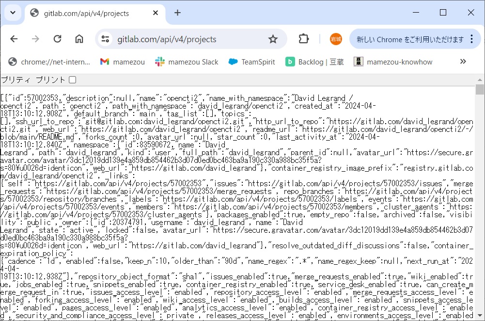
The Git hosting service I often use, Gitlab, publishes APIs such as REST, allowing you to retrieve various information. For example, sending a request to /projects will get you a list of projects in JSON format.
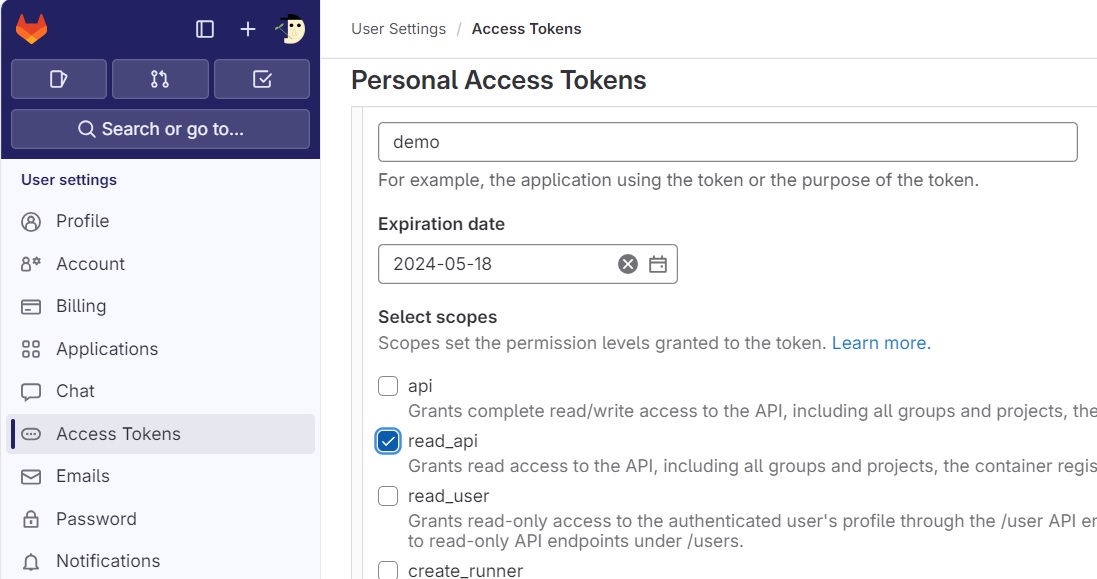
To prepare, sign in to Gitlab and issue an access token that allows read-api operations, and keep a note of it.
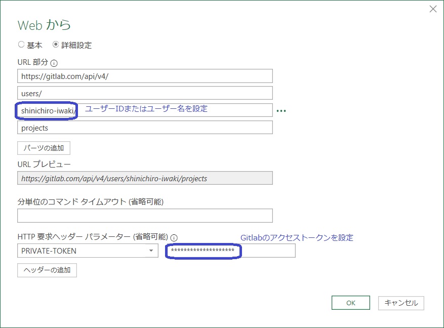
In PowerQuery, selecting 'Other Data Sources' -> 'Web' launches a dialog where you can enter a URL. If the API does not require authentication, entering the URL is sufficient, but here, as an example, I will retrieve a list of projects from my account. In the 'Advanced settings' of the dialog, you can set additional header information to be sent, such as the Gitlab access token in the PRIVATE-TOKEN header.
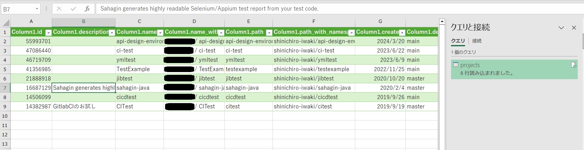
Once you set the necessary information and click 'OK', the PowerQuery editor screen switches, and the data retrieved from the API is displayed in tabular form. Although the data returned by Gitlab is in JSON format, appearing as a table of 'Records', clicking on any one Record allows you to view its contents.
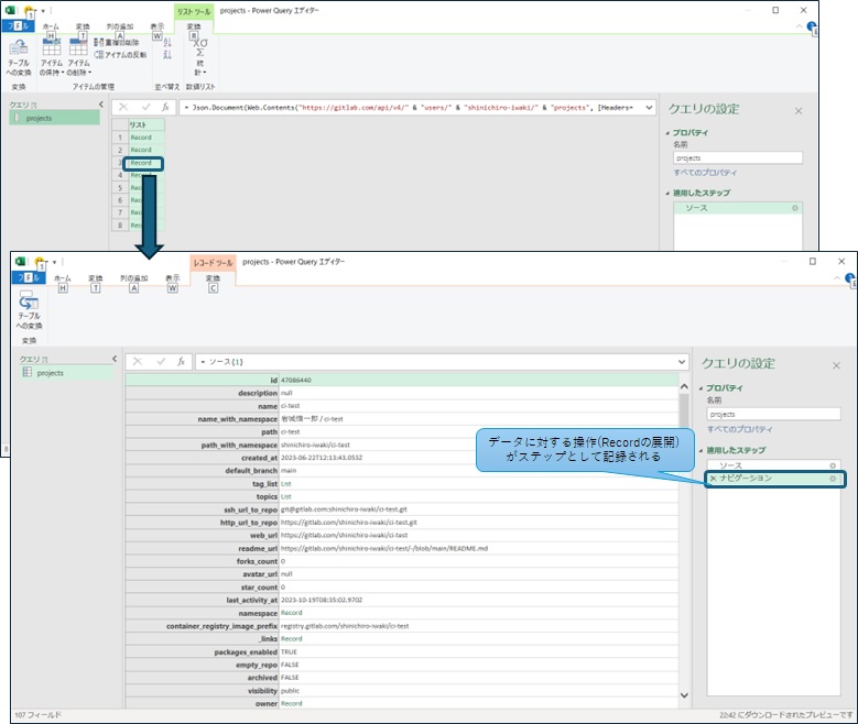
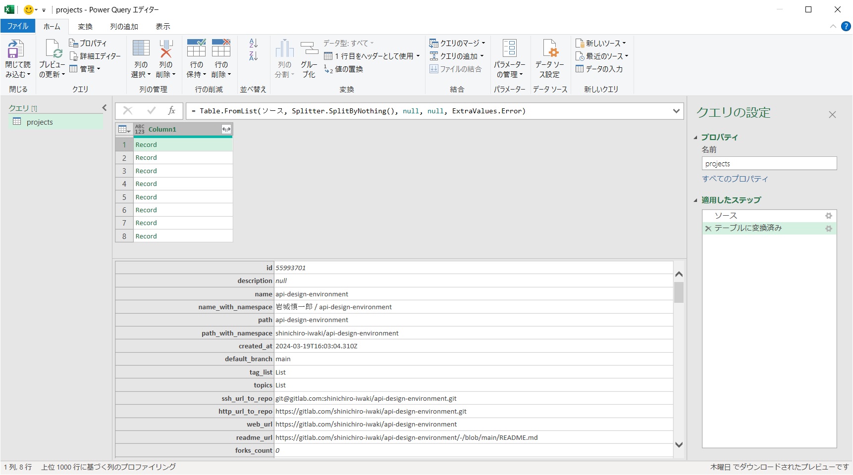
After acquiring the data, if it remains in JSON format, it's not suitable for analysis in Excel, so you need to convert the data into a table format. This can be done from the editor's 'Transform' menu by selecting 'Convert to Table'. The conversion process does not require splitting by delimiter or error handling for this data, so we use the default settings.
Once converted, the appearance of the first row changes to that of table data. Selecting a Record now shows the data in tabular form.
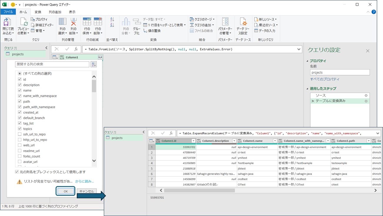
After converting the data to a table, you can expand each row's values into columns. Clicking the icon at the top right of the table allows you to select the rows you need to expand.
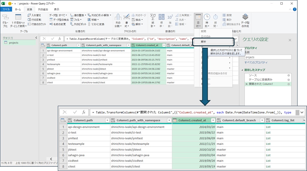
You can also perform operations like filtering, sorting, and transforming data in the editor. For example, the 'creation date' data from Gitlab, such as 2023-06-22T12:13:43.053Z, is a string representing standard time, but it's hard to analyze as a string, so you can convert it into date and time data.
By selecting 'Close & Load' in the editor, you can load the retrieved data onto Excel, allowing you to proceed with data analysis using Excel's features. The operations up to this point are recorded as a 'Query', so if there are changes in the data on the Gitlab side, you can 'Refresh' to reflect the latest data.
Analyzing Data with Pivot Tables
#While you can analyze the tabular data directly, Excel features a helpful tool called a 'Pivot Table' for analysis. Although the data volume in this example is small and could be directly observed, it's tough to analyze vast tables when the data volume increases. Pivot tables make it easy to aggregate data through UI operations.
You can perform pivot table analysis on Excel tables, but let's display the data we've retrieved directly in a pivot table. Right-clicking the query you created allows you to change the data load destination.
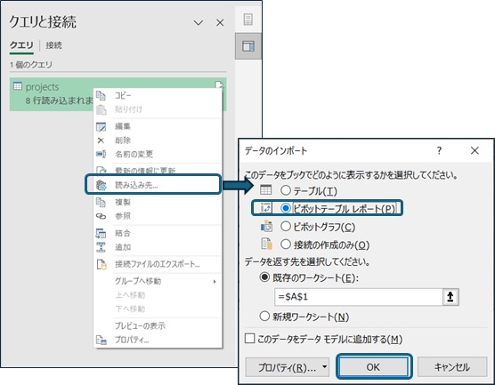
Setting the load destination to a pivot table displays the pivot table settings menu. A pivot table creates a table by aggregating the selected item values (total, average, etc.) or counts by the units of items selected for the rows (lines) and columns.
Suppose you drag the Column1.id data to the 'Values' area and the Column1.created_at data to the 'Rows' area. In that case, you can create a table aggregating the Gitlab project data IDs by creation date.
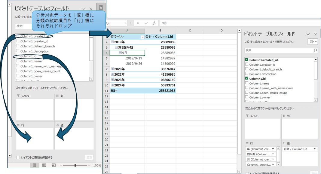
Depending on the Excel version you use, the aggregation content and value grouping are automatically performed based on the selected data. In my environment, the ID (numeric) is aggregated by total value, and the creation date (date) is grouped by year/quarter/month. You can freely change these settings via the right-click menu if the settings differ from your intentions.
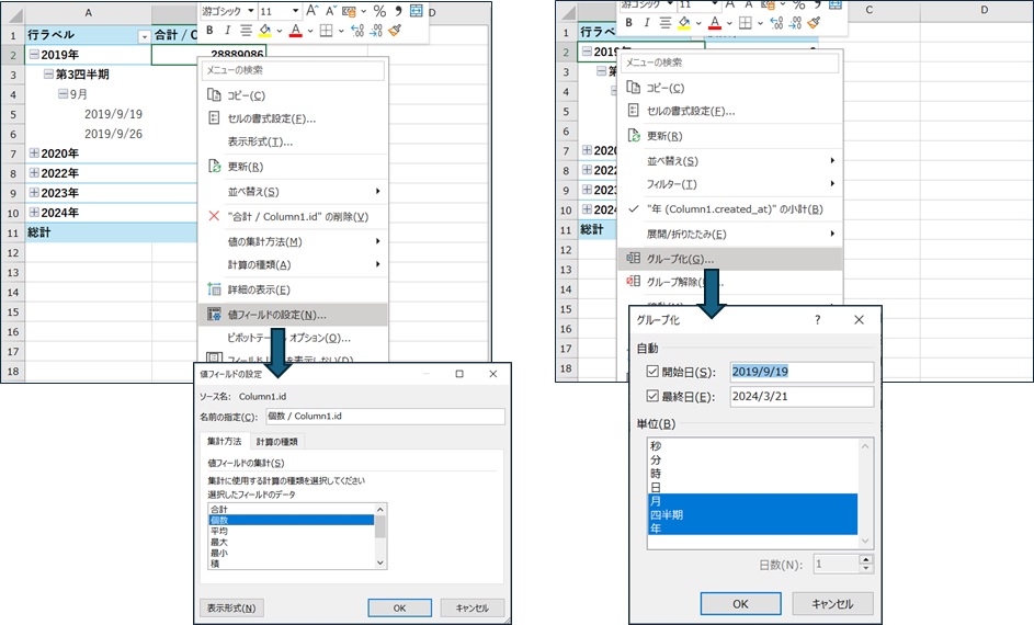
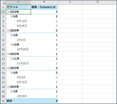
In this tabulation, the total of IDs is not very meaningful, so I have changed the tabulation to the number of data. Since the amount of data is small, I have also removed the quarterly grouping.
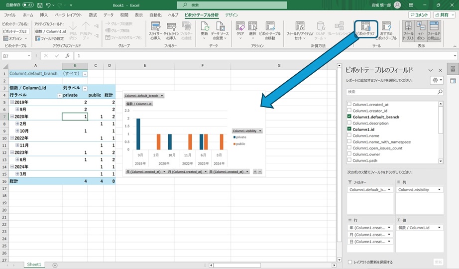
You can also graph the pivot table you created from the "Pivot Graph" menu in the Ribbon menu. Since I went to the trouble, I also set the horizontal axis and filters to graph the data, so you can easily summarize the aggregate results of the Gitlab project that you have created for each month.
Summary
#We introduced a simple data analysis method using Excel's features, using data obtainable from Gitlab's API as a subject. Although the tables and graphs created in this simple example could easily be made manually, they are very useful in cases with large data volumes or frequent data updates.
While there are many tools available for data analysis, and it might be more efficient to code the processes for serious analysis, Excel alone can achieve easy data analysis and clear presentation when you want to analyze data simply or present it understandably.